桑基图绘制
桑基图是一种特定类型的流程图,图中延伸的分支的宽度对应数据流量的大小,因1898年Matthew Henry Phineas Riall Sankey绘制的“蒸汽机的能源效率图”而闻名,此后便以其名字命名为“桑基图”。...
桑基图是一种特定类型的流程图,图中延伸的分支的宽度对应数据流量的大小,因1898年Matthew Henry Phineas Riall Sankey绘制的“蒸汽机的能源效率图”而闻名,此后便以其名字命名为“桑基图”。
载入数据
rm(list=ls())
data("iris")
iris$Class <- ifelse(iris$Petal.Width>1.2,"A","B")
iris$price <- ifelse(iris$Sepal.Length>5,"expensive","cheap")
数据预览
head(iris)
 Sepal.Length Sepal.Width Petal.Length Petal.Width Species Class     price
1          5.1         3.5          1.4         0.2  setosa     B expensive
2          4.9         3.0          1.4         0.2  setosa     B     cheap
3          4.7         3.2          1.3         0.2  setosa     B     cheap
4          4.6         3.1          1.5         0.2  setosa     B     cheap
5          5.0         3.6          1.4         0.2  setosa     B     cheap
6          5.4         3.9          1.7         0.4  setosa     B expensive
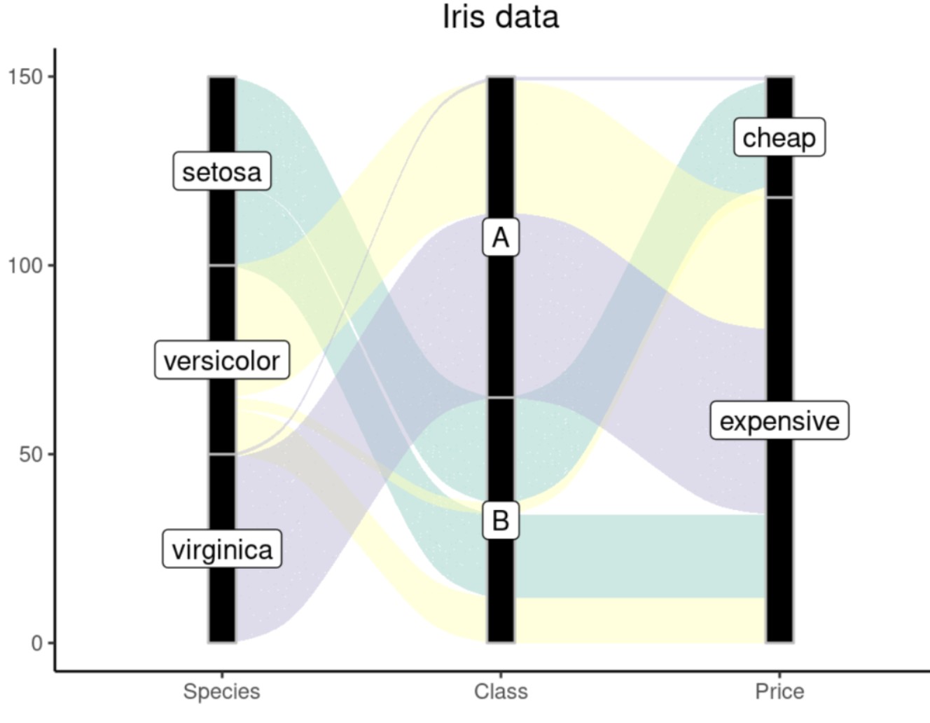
ggalluvial
library(ggplot2)
library(ggalluvial)
ggplot(iris,
       aes(axis1 = Species, axis2 = Class,axis3=price)) +#指定2个轴
  geom_alluvium(aes(fill = Species), width = 1/20) +
  geom_stratum(width = 1/10, fill = "black", color = "grey") +#规定纵向绘图格式
  geom_label(stat = "stratum", aes(label = after_stat(stratum))) +#添加标签,以显示各个节点的名称或标签,如果是text的话就没有外边框和底色了
  scale_x_discrete(limits = c("Species", "Class","Price")) +#规定横坐标位置
  scale_fill_brewer(type = "qual", palette = "Set3") +#规定填充颜色
  ggtitle("Iris data")+
  theme_bw()+
  theme(plot.title = element_text(hjust = 0.5))+#标题居中
  theme(legend.position = "none")#取消图例
图像如下:
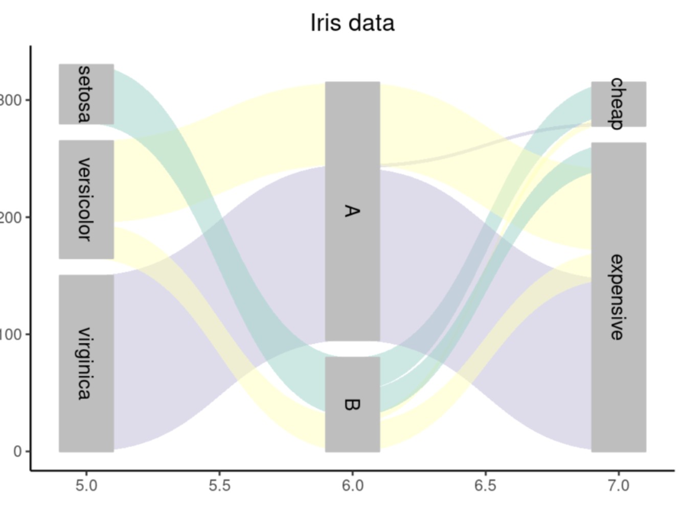
ggforce
数据处理,使其符合ggforce要求
library(ggforce)
#处理数据使其符合geom_parallel_sets的要求
iris1 <- gather_set_data(iris,5:7)
iris1$value <- ifelse(iris1$Species=="setosa",1,ifelse(iris1$Species=="versicolor",2,3))
head(iris1)
  Sepal.Length Sepal.Width Petal.Length Petal.Width value Species Class  price id x      y
1          5.1         3.5          1.4         0.2     1  setosa     B     expensive  1 5 setosa
2          4.9         3.0          1.4         0.2     1  setosa     B     cheap  2 5 setosa
3          4.7         3.2          1.3         0.2     1  setosa     B     cheap  3 5 setosa
4          4.6         3.1          1.5         0.2     1  setosa     B     cheap  4 5 setosa
5          5.0         3.6          1.4         0.2     1  setosa     B     cheap  5 5 setosa
6          5.4         3.9          1.7         0.4     1  setosa     B expensive  6 5 setosa
绘图代码:
ggplot(iris1, aes(x , id=id , split=y , value=value)) +#value决定了纵向坐标的位置
  geom_parallel_sets(aes(fill = Species), alpha = 0.5) +#绘图设置,透明度为0.5
  geom_parallel_sets_axes(axis.width = 0.2,fill="grey",color="grey") +# 轴样式设置
  geom_parallel_sets_labels(colour = 'black',angle = -90) +# 轴标签样式设置
  scale_fill_brewer(type = "qual", palette = "Set3")+
  ggtitle("Iris data")+
  xlab(" ")+
  theme_classic()+
  theme(plot.title = element_text(hjust = 0.5))+#标题居中
  theme(legend.position = "none")#取消图例
图像如下:
networkD3
数据处理:
# 选择567三列
iris2 <- iris[,c(5,6,7)]
# 统计三种变量两两组合的出现次数
library(dplyr)
data1 <- group_by(iris2,Species,Class)%>%
  summarise(.,count=n())
colnames(data1) <- c("source","target","value")
data2 <- group_by(iris2,Class,price)%>%
  summarise(.,count=n())
colnames(data2) <- c("source","target","value")
data <- rbind(data1,data2)
#将三种变量合并为一个列表
change <- c(as.character(unique(iris$Species)),unique(iris$Class),unique(iris$price))
for (i in change){
  print(which(change==i))
  data[data == i] <-  as.character(which(change==i)-1)
}
# 绘图所需两个表
nodes <-  data.frame("name" = change)
links <- apply (data,2,function (x) as.numeric (as.character (x)))
links  <-  as.data.frame(links)
数据预览:
>head(nodes)
        name
1     setosa
2 versicolor
3  virginica
4          B
5          A
6  expensive
> head(links)
  source target value
1      0     3    50
2      1     4    35
3      1     3    15
4      2     4    50
5      4     6     1
6      4     5    84
第一列为source,即连接线的起始端;
第二列为target,表示连接线的末端,这里的0-6分别代表nodes信息中的1-7个节点,注意这里的节点索引是从0开始的
第三列为value,表示连接线的宽度值,数值越大,发出的线条就会越宽
绘图代码:
library(networkD3)
sankeyNetwork(Links = links, Nodes = nodes,
  # 指定source、target、value以及nodeID对应的列名
  Source = "source",
  Target = "target",
  Value = "value",
  NodeID = "name",
  fontSize = 12,
  nodeWidth = 30,
  nodePadding = 8)
图像如下:
参考资料:
https://www.jianshu.com/p/2e4604ce66a5
https://zhuanlan.zhihu.com/p/554092872
https://zhuanlan.zhihu.com/p/138318632
- 发表于 2024-01-23 17:49
- 阅读 ( 2518 )
- 分类:R
