pheatmap绘制热图详解
pheatmap简介:
Pretty Heatmaps——Implementation of heatmaps that offers more control over dimensions and appearance.
热图是对实验数据(尤其是基因的表达量)分布情况进行分析的直观可视化方法,可以用来进行实验数据的质量控制和差异数据的具像化展示,还可以对数据和样品进行聚类,观测样品实验数据的相似性。
pheatmap使用方法,参数很多,这里给大家介绍比较常用的参数:
mat | 需要绘制热图的数字矩阵。 |
color | 表示颜色,赋值渐变颜色调色板colorRampPalette属性,选择“蓝,白,红”渐变,分为100个等级,,例:color = colorRampPalette(c(“navy”, “white”, “red”))(100) |
kmeans_k | 绘制热图的行聚类数,如果是NA,那么行不会聚类。 |
breaks | 设置mat数值范围的数字序列 |
border_color | 表示热图上单元格边框的颜色,如果不绘制边框,则使用NA |
cellwidth | 表示每个单元格的宽度,若选择NA则表示适应窗口 |
cellheight | 表示每个单元格的高度,若选择NA则表示适应窗口 |
scale | 表示值均一化的方向,或者按照行或列,或者没有,值可以是"row", “column” 或者"none" |
cluster_rows | 表示进行行的聚类,值可以是FALSE或TRUE |
cluster_cols | 表示进行列的聚类,值可以是FALSE或TRUE |
clustering_distance_rows | 表示行聚类使用的距离:欧式距离,相关系数等等 |
clustering_distance_cols | 表示列聚类使用的距离:欧式距离,相关系数等等 |
clustering_method | 表示聚类方法,值可以是hclust的任何一种,如"ward.D",“single”, “complete”, “average”, “mcquitty”, “median”, “centroid”, “ward.D2” |
clustering_callback | 回调函数来修改聚类 |
cutree_rows | 基于层次聚类(使用cutree)划分行的簇数(如果未聚集行,则忽略参数) |
cutree_cols | 基于层次聚类(使用cutree)划分列的簇数(如果未聚集行,则忽略参数) |
treeheight_row | 行的树的高度, |
treeheight_col | 列的树的高度 |
legend | TRUE或者FALSE,表示是否显示图例 |
legend_breaks | 设置图例的断点,如legend_breaks = -1:4 |
legend_labels | legend_breaks对应的标签例:legend_breaks = -1:4, legend_labels = c(“0”,“1e-4”, “1e-3”, “1e-2”, “1e-1”, “1”) |
annotation_row | 行的分组信息,需要使用相应的行名称来匹配数据和注释中的行,注意之后颜色设置会考虑离散值还是连续值,格式要求为数据框 |
annotation_col | 列的分组信息,需要使用相应的列名称来匹配数据和注释中的列,格式要求为数据框 |
annotation_colors | 用于手动指定annotation_row和annotation_col track颜色的列表。 |
annotation_legend | 是否显示图例的名称。 |
annotation_names_row | 是否显示行注释的名称。 |
annotation_names_col | 是否显示列注释的名称。 |
show_rownames | 是否显示行名 |
show_colnames | 是否显示列名 |
main | 图的名字 |
fontsize | 图的字体大小 |
fontsize_row | 行名的字体大小,默认与图的字体大小相同 |
fontsize_col | 列名的字体大小,默认与图的字体大小相同 |
angle_col | 列标签的角度,可选择 (0, 45, 90, 270 and 315) |
display_numbers | 表示是否将数值显示在热图的格子中,如果这是一个矩阵(与原始矩阵具有相同的尺寸),则显示矩阵的内容而不是原始值。 |
number_format | 设置显示数值的格式,较常用的有"%.2f"(保留小数点后两位),"%.1e"(科学计数法显示,保留小数点后一位) |
number_color | 设置显示内容的颜色 |
fontsize_number | 设置显示内容的字体大小 |
labels_row | 代替行名的自定义标签 |
labels_col | 代替列名的自定义标签 |
filename | 图片保存位置以及文件名 |
width | 手动设置输出文件的宽度(单位:英寸) |
height | 手动设置输出文件的高度(单位:英寸) |
silent | 不绘制热图 |
na_col | 缺失值的颜色 |
pheatmap包安装与数据准备:
R包安装技巧详情见:https://www.omicsclass.com/article/106 示例数据:test.rar
install.packages(pheatmap)     #安装包
# load package
library(pheatmap)
data <- read.delim("D:/test.txt", header=T, row.names="gene")
data_subset <- as.matrix(data[rowSums(data)>80000,])
test<-data_subset
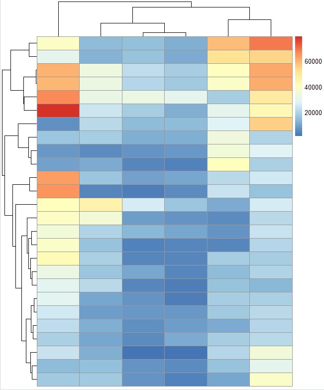
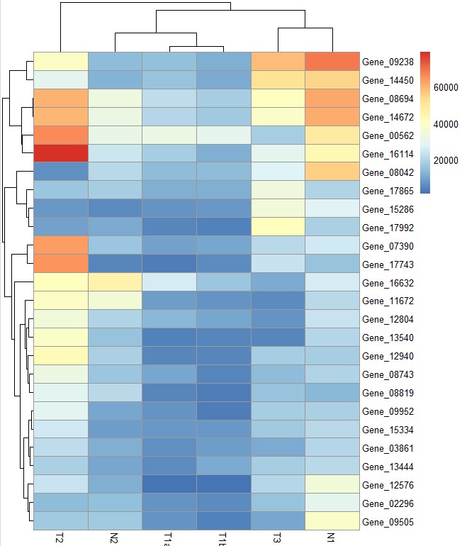
pheatmap基础绘图示例
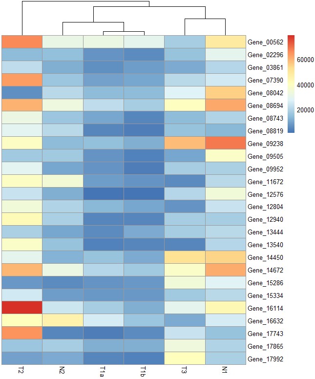
# 默认绘图
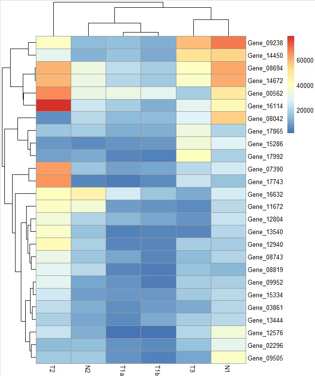
pheatmap(test)
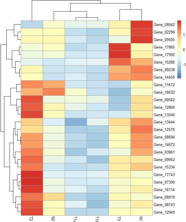
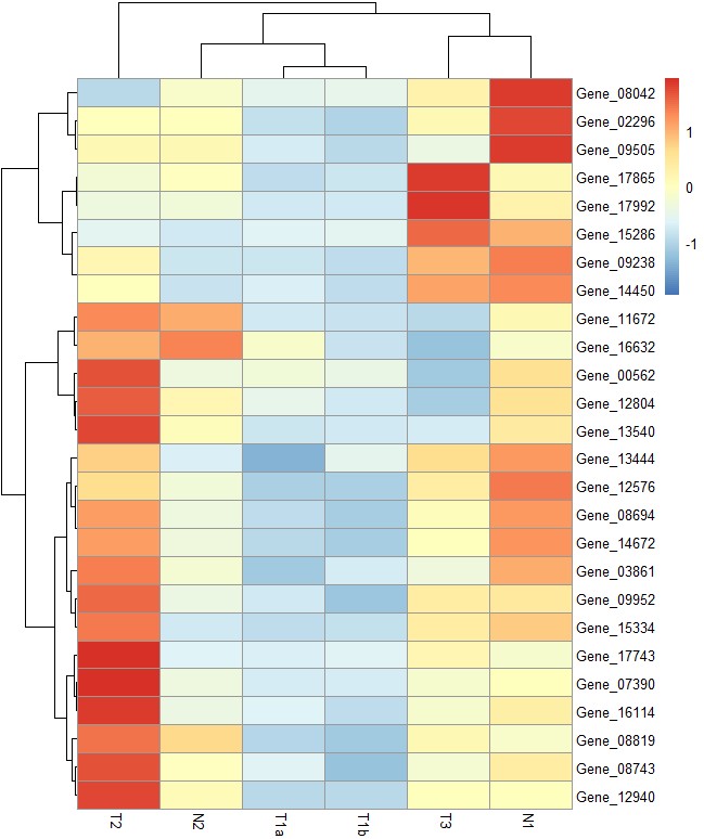
# scale = "row"参数对行进行归一化,还可设置 "column" and "none"
pheatmap(test, scale = "row")
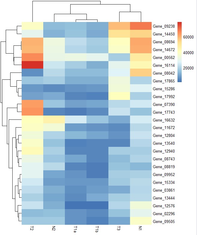
# clustering_method参数设定不同聚类方法,默认为"complete",可以设定为'ward', 'ward.D', 'ward.D2', 'single', 'complete', 'average', 'mcquitty', 'median' or 'centroid'
pheatmap(test,scale = "row", clustering_method = "average")
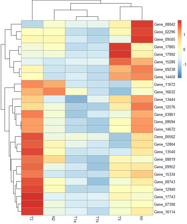
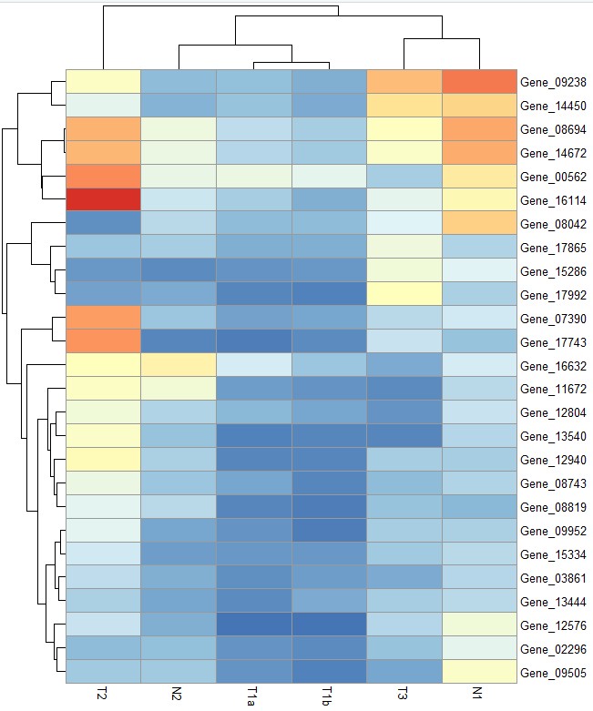
# clustering_distance_rows = "correlation"参数设定行聚类距离方法为Pearson corralation,默认为欧氏距离"euclidean"
pheatmap(test, scale = "row", clustering_distance_rows = "correlation")
# color参数自定义颜色  更多颜色设置见:https://www.omicsclass.com/article/783
pheatmap(test, color = colorRampPalette(c("navy", "white", "firebrick3"))(50))

# cluster_row = FALSE参数设定不对行进行聚类
pheatmap(test, cluster_row = FALSE)
# legend_breaks参数设定图例显示范围,legend_labels参数添加图例标签
pheatmap(test, legend_breaks = c(10000,20000,30000,40000,60000), legend_labels = c("10000","20000","30000","40000","60000"))

# legend = FALSE参数去掉图例
pheatmap(test, legend = FALSE)
# border_color参数设定每个热图格子的边框色
pheatmap(test, border_color = "black")

# border=FALSE参数去掉边框线
pheatmap(test, border=FALSE)
# show_rownames和show_colnames参数设定是否显示行名和列名
pheatmap(test,show_rownames=F,show_colnames=F)
# treeheight_row和treeheight_col参数设定行和列聚类树的高度,默认为50
pheatmap(test, treeheight_row = 30, treeheight_col = 50)
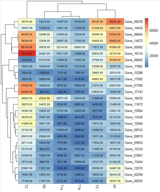
# display_numbers = TRUE参数设定在每个热图格子中显示相应的数值,number_color参数设置数值字体的颜色
pheatmap(test, display_numbers = TRUE,number_color = "black")
# number_format = "%.1e"参数设定数值的显示格式
pheatmap(test, display_numbers = TRUE, number_format = "%.1e")

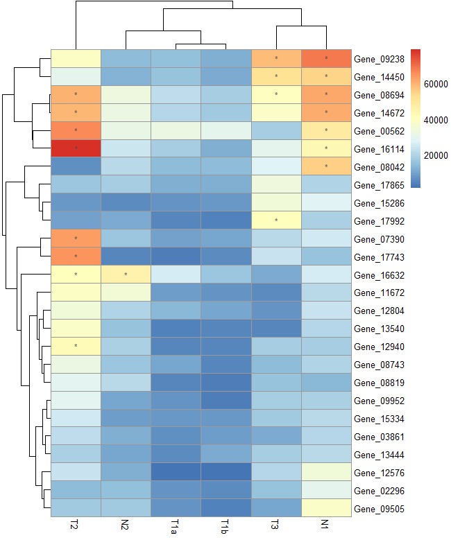
# 自定义数值的显示方式
pheatmap(test, display_numbers = matrix(ifelse(test > 40000, "*", ""), nrow(test)))
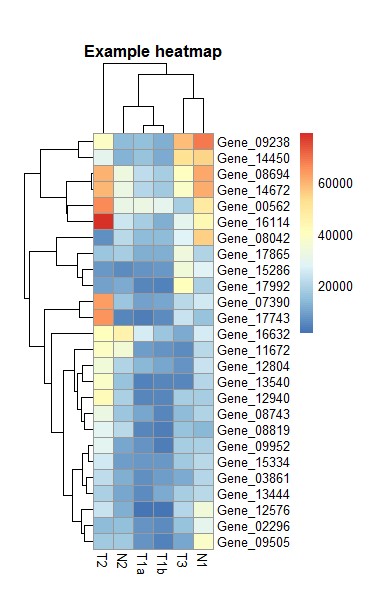
# cellwidth和cellheight参数设定每个热图格子的宽度和高度,main参数添加主标题
pheatmap(test, cellwidth = 15, cellheight = 12, main = "Example heatmap")
对样本或者基因标记分类
# 构建列注释信息
my_sample_col <- data.frame(sample = rep(c("tumour", "normal"), c(4,2)),
                            Time=c(1,1,2,2,2,1)
                            )
row.names(my_sample_col) <- colnames(test)
head(my_sample_col)
    sample Time
T1a tumour    1
T1b tumour    1
T2  tumour    2
T3  tumour    2
N1  normal    2
N2  normal    1
# 构建行注释信息,这里代码产生分组信息,也可以从数据读入一个表格,聚类树分隔详情见:https://www.omicsclass.com/article/508
list=pheatmap(test)
my_gene_col=cutree(list$tree_row,k=2)
my_gene_col <- data.frame(cluster = ifelse(test = my_gene_col == 1, yes = "cluster 1", no = "cluster 2"))
set.seed(1984)
my_random <- as.factor(sample(x = 1:2, size = nrow(my_gene_col), replace = TRUE))
my_gene_col$random <- my_random
head(my_gene_col)
             cluster random
Gene_00562 cluster 1      2
Gene_02296 cluster 2      2
Gene_03861 cluster 2      2
Gene_07390 cluster 2      2
Gene_08042 cluster 2      1
Gene_08694 cluster 1      1
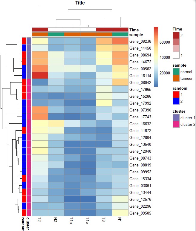
准备好行列注释就可以绘图:
pheatmap(test, annotation_row = my_gene_col, annotation_col = my_sample_col)

自定义分组颜色:
ann_colors = list(
  Time = c("white", "firebrick"),
  sample = c(normal = "#1B9E77", tumour = "#D95F02"),
  cluster = c(`cluster 1` = "#7570B3", `cluster 2` = "#E7298A"),
  random=c(`1`="red",`2`="blue")
)
head(ann_colors)
# annotation_colors设定注释信息的颜色
pheatmap(test, annotation_col = my_sample_col,annotation_row =my_gene_col , annotation_colors = ann_colors, main = "Title")
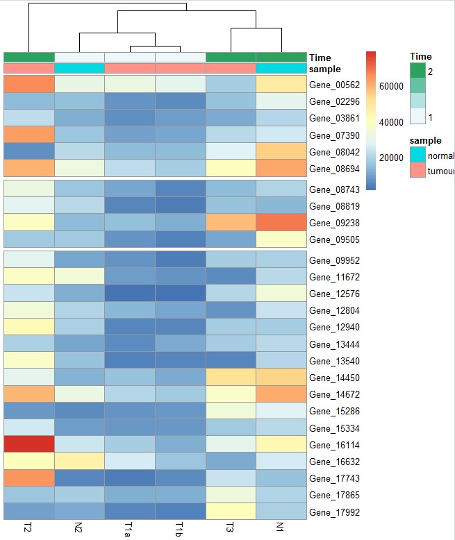
热图分块显示:
分块中的基因:https://www.omicsclass.com/article/508
# 手动指定gap划分区块:gaps_row = c(6, 10)参数在第6和10行处添加gap, 要求对行不进行聚类。对应的还有gaps_col,大家也可以试试
pheatmap(test, annotation_col = my_sample_col, cluster_rows = FALSE, gaps_row = c(6, 10))
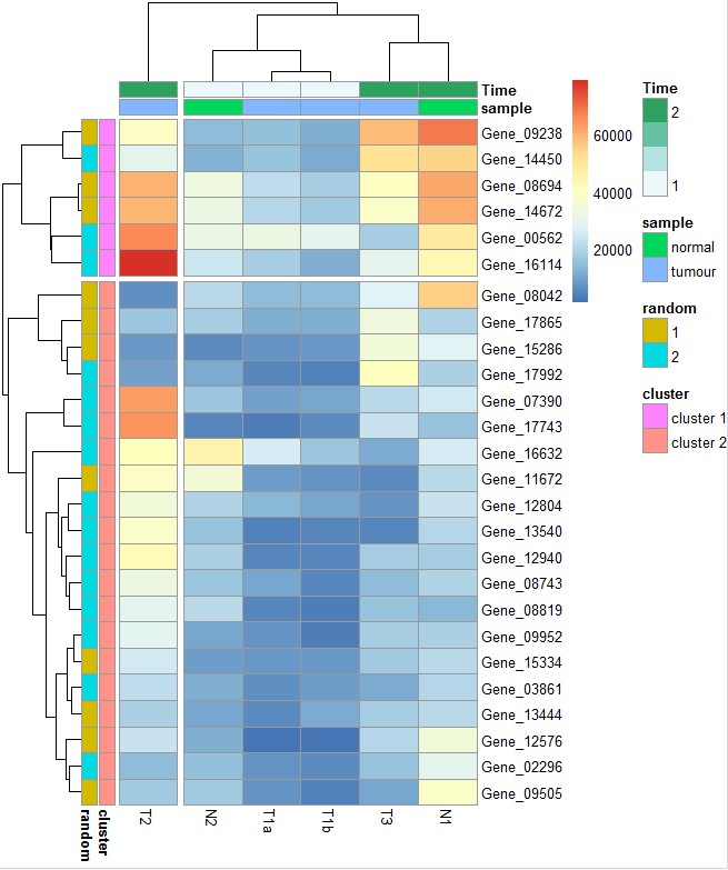
# cutree_col = 2,cutree_rows=2参数将列按聚类树的结果分成两部分, 要求对列和进行聚类
pheatmap(test,
         annotation_row = my_gene_col,
         annotation_col = my_sample_col,
         cutree_rows = 2,
         cutree_cols = 2)
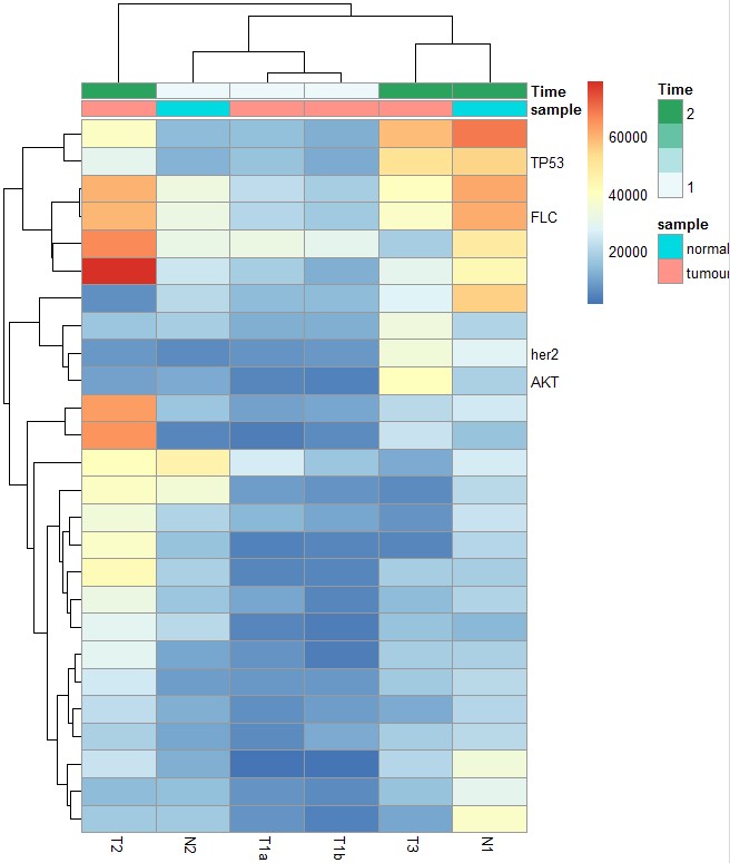
# 自定义行的标签名。注意:基因名称的顺序与原始表格的顺序一致,而不是聚类后的顺序:
labels_row = c("", "", "", "", "", "", "", "", "", "", "", "", "", "", "",
               "", "", "TP53", "FLC", "her2","","","","","","AKT")
# labels_row参数添加行标签
pheatmap(test, annotation_col = my_sample_col, labels_row = labels_row)
 如果想提升自己的绘图技能,我们推荐:R语言绘图基础(ggplot2) R语言入门
更多生物信息课程:https://study.omicsclass.com/index
- 发表于 2020-01-18 14:02
- 阅读 ( 33055 )
- 分类:R