feature 重要性排序棒棒糖图
feature 重要性排序棒棒糖图
# ================== 1. 安装必要包(如果尚未安装)==================
# 如果是第一次运行,请取消下面两行的注释并运行安装
# install.packages("ggplot2")
# install.packages("dplyr")
# install.packages("data.table") # 用于 fread
# ================== 2. 加载所需库 ==================
library(ggplot2)
library(dplyr)
library(data.table) # 使用 fread 读取表格
# ================== 3. 创建数据 ==================
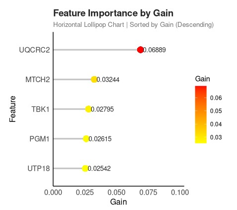
df <- data.table::fread("
Feature Gain Cover Frequency
UQCRC2 0.0688893642 0.0649316036 0.0415455633
MTCH2 0.0324376628 0.0273261500 0.0213711746
TBK1 0.0279487991 0.0339715594 0.0196614806
PGM1 0.0261452220 0.0329089525 0.0230808685
UTP18 0.0254163911 0.0275343985 0.0179517866
")
# 转为 data.frame(ggplot2 兼容)
df <- as.data.frame(df)
# 按 Gain 降序排序:最重要的特征在最上面
df <- df %>% arrange(desc(Gain))
# ================== 4. 绘制棒棒糖图 ==================
p <- ggplot(df, aes(x = Gain, y = reorder(Feature, Gain))) +
# 绘制“棒”:从 x=0 到 x=Gain 的线段
geom_segment(
aes(x = 0, xend = Gain, yend = Feature),
color = "gray80",
size = 1.1
) +
# 绘制“糖”:点的大小固定,颜色根据 Gain 渐变
geom_point(aes(color = Gain), size = 4.5, shape = 16) +
# 可选:在点右侧添加数值标签
geom_text(
aes(label = round(Gain, 5)),
hjust = -0.1,
size = 3.5,
color = "gray20"
) +
# 设置颜色渐变:浅蓝 → 深蓝
scale_color_gradient(
low = "yellow", # 浅蓝色(小值)
high = "red", # 深红色色(大值)
name = "Gain"
) +
# 添加标题和标签
labs(
title = "Feature Importance by Gain",
subtitle = "Horizontal Lollipop Chart | Sorted by Gain (Descending)",
x = "Gain",
y = "Feature"
) +
scale_x_continuous(
expand = expansion(mult = c(0, 0.5)) # 在 x 轴右侧添加一些空间
) +
# 使用极简主题,并完全移除网格线
theme_minimal() +
theme(
# 完全删除所有网格线
panel.grid = element_blank(),
# 坐标轴
axis.line = element_line(color = "black", size = 0.5),
# 文字大小
axis.text = element_text(size = 11),
axis.title = element_text(size = 12),
# 标题样式
plot.title = element_text(size = 14, face = "bold", color = "#2B2B2B"),
plot.subtitle = element_text(size = 10, color = "gray50"),
# 去除背景
panel.background = element_blank(),
# 边距
plot.margin = margin(0.6, 1.5, 0.6, 0.6, "cm")
)
# ================== 5. 显示图形 ==================
print(p)
# ================== 6. (可选)保存图片 ==================
# ggsave("lollipop_feature_gain.png", plot = p, width = 9, height = 4.5, dpi = 300, bg = "white")
- 发表于 2025-08-08 16:00
- 阅读 ( 2883 )
- 分类:转录组